2024

Discovery
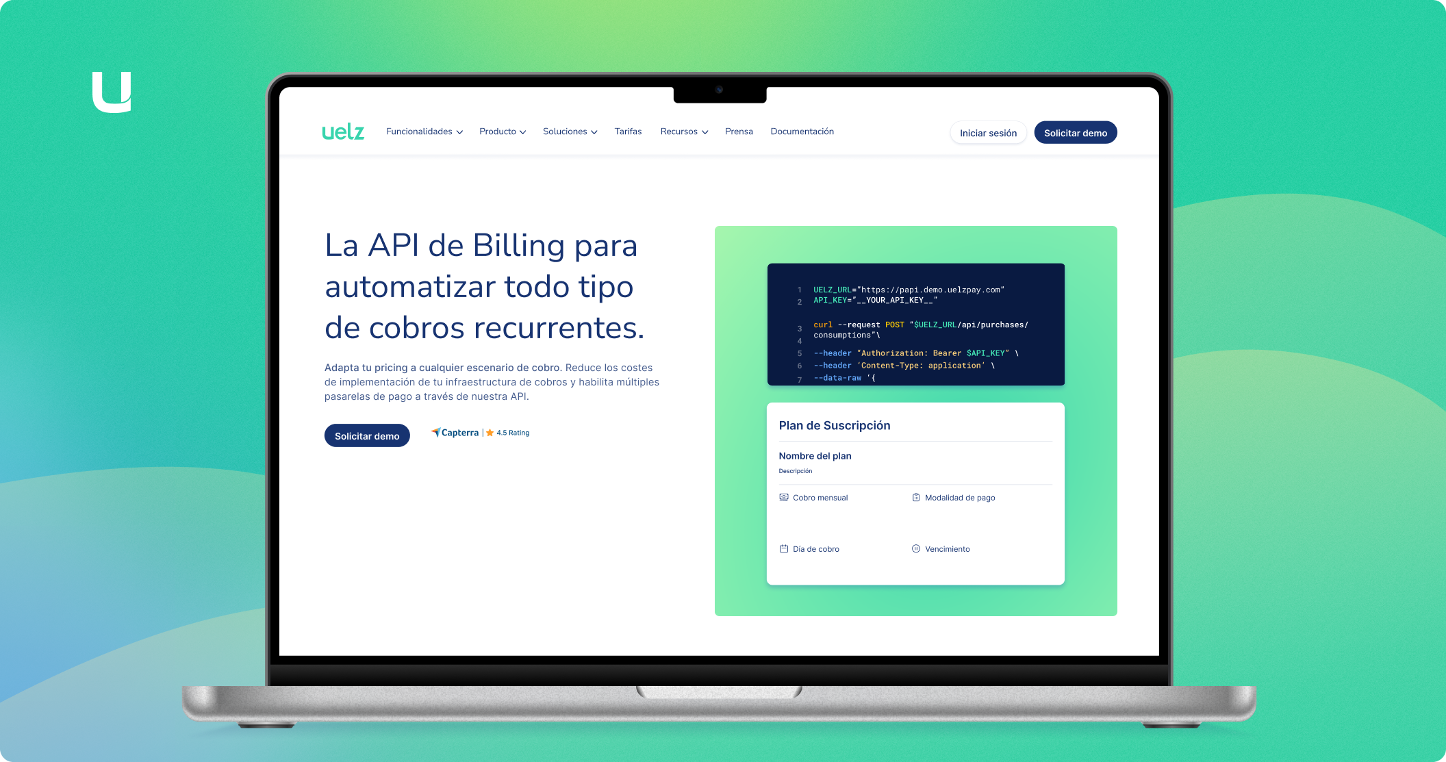
Uelz is a young startup focused on creating a Billing API to automate all types of recurring charges. Over time, it has evolved its commercial strategy and shifted its focus toward a higher-end target audience. It is currently aimed at large companies that process a high volume of recurring transactions and need to modernize and delegate their entire billing infrastructure.
Uelz offers two usage modes: via API or through its proprietary software with its own interface and development. It allows clients to adapt to any type of payment model with an international reach.
Although they are confident in their product’s potential, they acknowledge that it is not easy for their target audience to grasp or visualize. As a result, the marketing and support teams have been gathering common doubts and misconceptions for quite some time. So far, they have tested various copies on their website as their product has evolved. They now believe they have found the right message that clearly defines who they are and what advantages their product offers. However, they are still struggling with user acquisition.
Additionally, many users who access their demo are not their actual target audience, and in some cases, they are confused about the platform’s functionalities.
Project Objectives
Validate that the message received by users who visit Uelz's website aligns with the company's own description and concept of its software. In other words, ensure that users understand what Uelz is and what advantages it offers through the website.
To achieve this, it will be necessary to conduct a study where objectives and hypotheses are defined, along with determining the best methodology for validation.
Define the problem
First and foremost, it will be necessary to speak with the department that brought this issue to the design team and gather as much information as possible about the doubts users have. This includes verifying whether that information is present on the website and how it is communicated. Once all relevant data has been collected, the next step is to formulate the main hypothesis that will guide the entire research process.
General Hypothesis
The target audience does not understand what Uelz is through the website due to a lack of clarity in the value proposition and information structure. We will confirm this if at least 60% of users in usability tests are unable to correctly describe Uelz's purpose after browsing the website.
Similarly, I break down the general hypothesis into smaller ones that help identify more specific friction points.
Specific Hypotheses
Uelz's service is not understood because the overall communication on the site is unclear and does not define the product’s purpose.
Uelz’s value proposition is unclear because the main message does not accurately convey its benefits.
The offered functionalities are confusing for users because they are not clearly presented.
Tech users do not understand what Uelz is through the documentation because they cannot find the necessary information.
As a result, I obtain different hypotheses to iterate on in order to validate the general hypothesis. These specific hypotheses will help determine the research method that best fits the inquiry.
Methodology & structure of the process
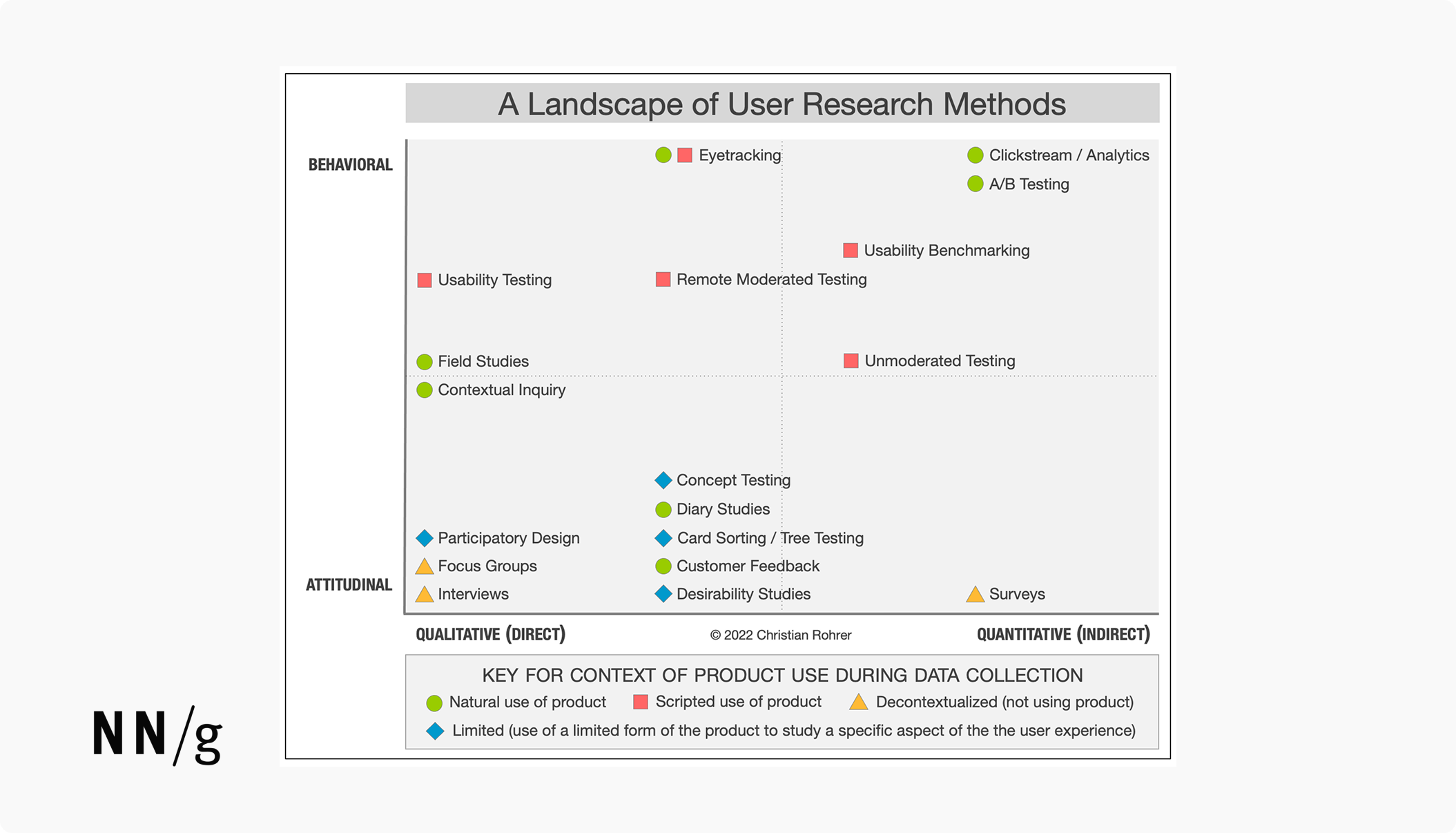
Qualitative studies generate data on behaviors or attitudes based on direct observation and listening, whereas in quantitative studies, data on the behavior or attitudes in question are collected indirectly through measurement or tools such as surveys or analytics platforms. Qualitative methods are much better suited for answering questions about why something happens or how to fix a problem, whereas quantitative methods are more effective for answering how many or how much types of questions.
Since the key question to answer is why users do not understand what Uelz is through the website, I choose a qualitative methodology.
Below, I have attached a table from the Nielsen Norman Group website that illustrates 20 popular research methods based on their study dimensions. This chart serves as a decision-making guide to help determine which method best fits our research objective.

Among all the methodologies, I choose Contextual Inquiry, where users can interact with the product naturally while being observed and asked questions to better understand how and why they behave the way they do.
Study Structure: Contextual Research
Based on real product usage—the actual website—I structure an online interview for ideal users. The type of information to be collected relies on observation, impressions, and reasoning regarding their understanding of the website (Narrative Research). To achieve this, and considering the specific hypotheses, I develop a script aimed at validating them.
Additionally, before the interview, I decide to include a short test called the 10-Second Test. This will allow me to quickly analyze what users think, their first impression, and what they understand at first glance. Many studies suggest that the first few seconds of navigating a digital product are crucial for making a positive impact. Users should understand what the site is about as quickly as possible.
Interview Structure
Phase 01: 10-Second Test on the Homepage
The homepage is shown to the user for 5 to 10 seconds to quickly analyze their thoughts and first impression. The goal is to understand what they grasp at first glance through a single question:
“What is the website you just viewed about?”
Phase 02: Scripted Questions About the Website
The user will be allowed to freely navigate through the entire website until they feel ready to answer the same question again. The goal is to validate whether their perception has changed and why. This will help assess the correlation between their first impression and a more in-depth analysis.
Additionally, throughout the interview, the script will be used to ask parallel questions based on their responses, aiming to further explore their reasoning and insights.
Estimated Time: 30 Minutes
User Recruitment
Recruiting the right users for the study is almost as important as selecting the appropriate UX research method. In this case, the ideal participants are those with a professional background in technology-related businesses, who are familiar with or have worked with subscription-based business models, or those involved in developing and implementing code infrastructures for their companies—specifically, backend profiles.
I define two ideal interviewee profiles, categorized by their professional background, and send them a screener with the following criteria to determine their eligibility for the research.
Users
Type A: Business Profile
- Familiar with or knowledgeable about Stripe.
- Experience working with recurring payment plans and has encountered challenges in managing payments, such as pricing infrastructures or billing plans.
- Familiar with or has managed online payments through their business at some point.Type B: Development Profile
- Familiar with or knowledgeable about Stripe.
- Understands what an API is and/or has worked with one.
- Knows how a checkout works at a technical level or has experience working with payment gateways.
Total Sample: 5 Users. 2 Business profiles. 3 Development profile.
Analysis & insights
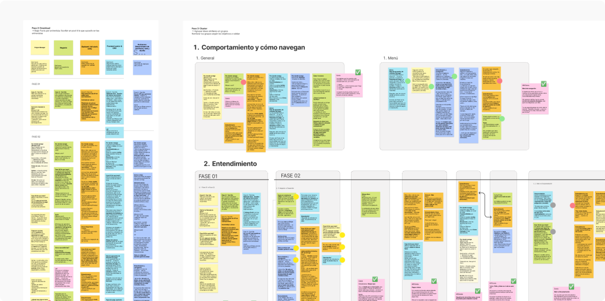
To analyze the collected information, I transcribe the recordings and create an Affinity Diagram, visually organizing the different responses using post-its. These responses are grouped based on the research objectives, allowing for a clearer identification of patterns and insights.
Website Navigation
Product Understanding
Value and Functionalities
Documentation

Once all the ideas are placed into their respective categories, the concepts are grouped to extract the final conclusions.
Presentation of conclusions
After grouping the different categories and clustering post-its that reflect the same concept or idea, the final conclusions are drafted.
I write them in a way that reflects the users' own statements, either confirming or refuting the hypotheses.
Conclusions
Navigational Behavior
- All users identified the same key pages to understand the product: Home, How It Works, Documentation, and Pricing. (5/5)
- Most users checked the "How do I know if Uelz is for me?" question in the FAQs section under Pricing. (3/5)
- The majority of users found having to request contact to try the product to be a friction point. (3/5)Product Understanding
- All users lost focus on the main message (Billing API) as they navigated through the content. (5/5)
- Most users did not find answers to their questions in the documentation. (2/3)
- The majority of users better understood Uelz’s purpose thanks to the menu structure. (4/5)
- Some users expressed doubts about the possibility of generating one-time charges. (2/5)
- Most users felt the need for more internal navigation links both on the website and within the documentation. (3/5)Value and Features
- No users saw competitive advantages in using Uelz over Stripe. (5/5)
- Most users appreciated having all payment management in one platform. (4/5)
- The majority understood the value of a single integration API for multiple payment providers. (3/5)
- Most users assumed Uelz operates in different countries and perceived it as an international advantage. (3/5)
- A significant number of users expressed uncertainty about security management and fraud prevention. (3/5)Documentation: Relevance and Understanding
- Most users consult the documentation only after understanding the product’s benefits. (4/5)
- The user who explored the documentation the most had difficulty understanding the structure of services and plans. (1/3)
- The same user demonstrated a clear internal navigation pattern within the documentation. (1/3)
Conclusion
Following collaboration with the marketing department, I redesigned aspects of the website and created new design structures to clarify information and provide users with useful content.
The redesign successfully increased user engagement, reduced repetitive questions, and improved the overall site experience