Ago 2024, 2 months
Discovery
Legal consultancy based in Valencia (Spain), established with the goal of becoming a leading firm in the legal sector. They offer specialized services and personalized attention to both individuals and businesses, characterized by their close and consistent relationship with clients. Their mission is to provide a more approachable way of understanding and addressing client needs.
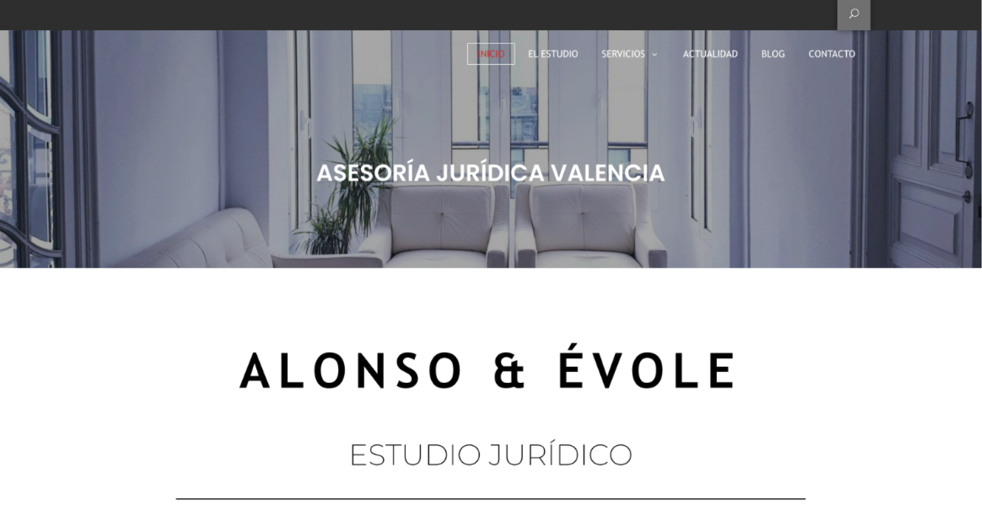
Since its inception in the sector, the consultancy has grown in both its number of clients and the prominence of those clients. However, their corporate identity remains underdeveloped, with inconsistencies in internal documentation, such as the use of varying colors and fonts without a clear purpose. Additionally, the website was originally built using a generic template, featuring outdated images of the old office and outdated information about services and areas of expertise.
The goal of the new identity is to appeal to a higher-income audience while maintaining the approachability that defines them. At the same time, they aim to continue resonating with the ‘young-artist’ demographic, which has been their strongest support base to date.
Project objectives
Redesign the corporate identity to reflect the brand’s maturity while preserving its approachable and professional tone. Apply this new identity across internal stationery, business cards, and the website, creating a cohesive corporate presence that unifies the brand. This will enable them to present themselves in a more professional manner aligned with the new target audience they aim to reach.
Restructure the content by updating it and adding new services.
Previous home website
Research Desk
To kick off the website redesign process, I conduct desk research to gather information about direct competitors and how they have approached their content, corporate identity, and website usability. The client also provides a list of their direct competitors and key references within the sector. Using this information, I carry out an analysis of the provided competition, identifying their strengths and points of differentiation, as well as the communication strategies they employ and how these may have benefited them.
Insights
Simple navigation and streamlined content. Considering the terminology and language used in the sector, aim for a straightforward navigation experience. Additionally, organize the content clearly within each section of the website.
Spacious layouts that allow users to take visual breaks from content while serving as focal points for new messages.
A sober and contemporary aesthetic.
Simplified identity. Since the consultancy handles a significant amount of online documentation, create a straightforward and easy-to-implement identity.
Convey an approachable tone.
Avoid overusing stock images with generic legal content, differentiating the brand from competitors who rely heavily on them.
Emphasize the importance of articles for SEO, encouraging readers to engage with the content throughout the website.
Web Content Audit
To assess the existing website's design, I conducted a content audit and inventory. Among all the pages, 80% contained duplicate and outdated content, though it was easy to locate. Additionally, the distinction between the Blog and News sections is unclear, as the articles in both are mixed, with some blog posts now outdated. There is also no clear way to search for specific articles, and the categories are confusing.
The pages dedicated to different services are interlinked as if they were blog posts, but they fail to link to related articles within the same topic. This prevents the site from showcasing the client’s expertise in a specific area or directing users to the corresponding service page after encountering a relevant article. This reveals a critical issue with internal linking, which does not help users navigate to the content they are looking for.
Regarding the contact form on the Contact page, I noticed it lacks a text field for users to add a detailed inquiry beyond simply stating the subject. On the other hand, the website integrates a direct plugin for accessing the client’s WhatsApp chat, which serves as one of the primary communication channels for users.
In the original footer, there is a "How to Get Here" link that leads to a landing page containing only the consultancy’s location and a map. In the redesign, this information will be streamlined, making the contact and location details visible directly in the footer and ensuring they are accessible across all site footers.
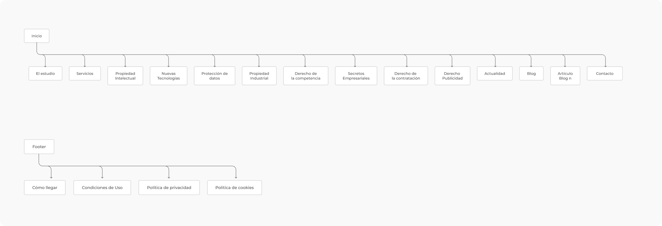
For contrast, below is the redesigned sitemap, which also features a new SEO-optimized architecture to guide users and help Google better understand the site's content.
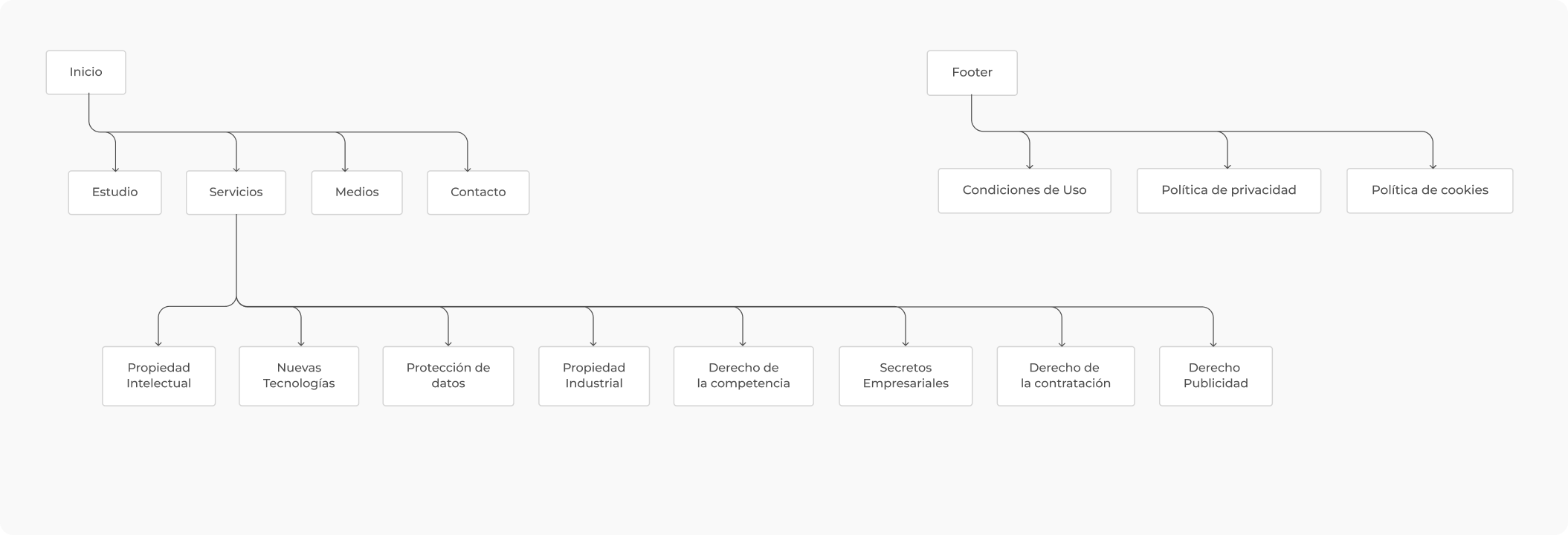
SEO architecture
Con respecto a la estructura SEO dentro del site, se realiza una auditoría independiente para comprobar la jerarquía de contenido en cada una de las páginas donde existan todas las etiquetas correspondientes a los headings, hipervínculos y links, así cómo la estructura de contenido HTML5. Se revisan también todos los enlaces dañados u obsoletos, así como otras técnicas SEO que Google recientemente ha empezado a penalizar: thin content o keyword stuffing, entre otros.
Early Designs & Iteration
Knowing my client need's, I embarked on designing a solution that prioritized clarity in the structure of the visual content, without abusing generic images about the services provided and could make a difference with competitors.
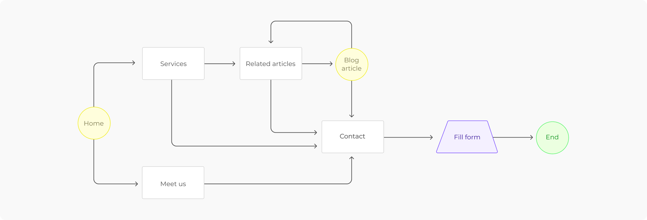
As well as defining the user flow of the website to emphasize how the internal linking would work and how it benefits both the user and the client: ensuring easy and continuous navigation through the website's content, offering users posts and information related to their search.
Branding & Style Sheet
With the goal of creating a strong identity while maintaining the previous naming, the aim is to redesign the identity in a way that can be easily applied to the website, ensuring both are in harmony.
Personal story as a personal brand
Knowing the client and understanding their preferences, this consultancy is a personal project that started from scratch years ago and now aims to turn it into a brand. One of its key differentiating values is personalized and individual attention-meaning they want to give each client the care they deserve and focus on maintaining a close relationship, as the matters they deal with can sometimes be sensitive or involve complicated situations for their clients.
For this reason, the client has chosen to shape their identity as a reflection of their personality and hobby: architecture.
"
Born in Valencia, I’ve been in love with this city since my adolescence. Every corner has something new to offer, and together, they form a unique essence. Getting lost in its streets, discovering its architecture and history, is one of my great hobbies as a lover of beauty, coherence, and visual balance.
There is a similar connection to law. I seek solutions that find that balance and consistency, providing security and robustness to any person or business with ambitions to achieve their goals and ensure they endure over time.

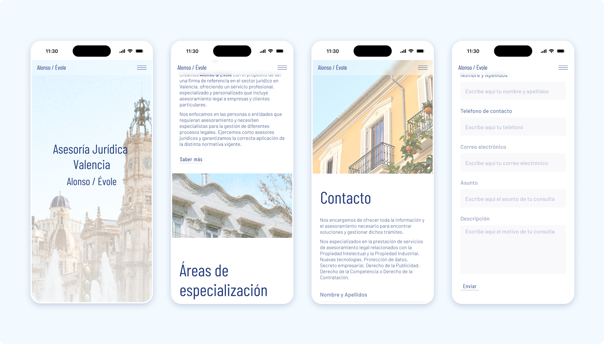
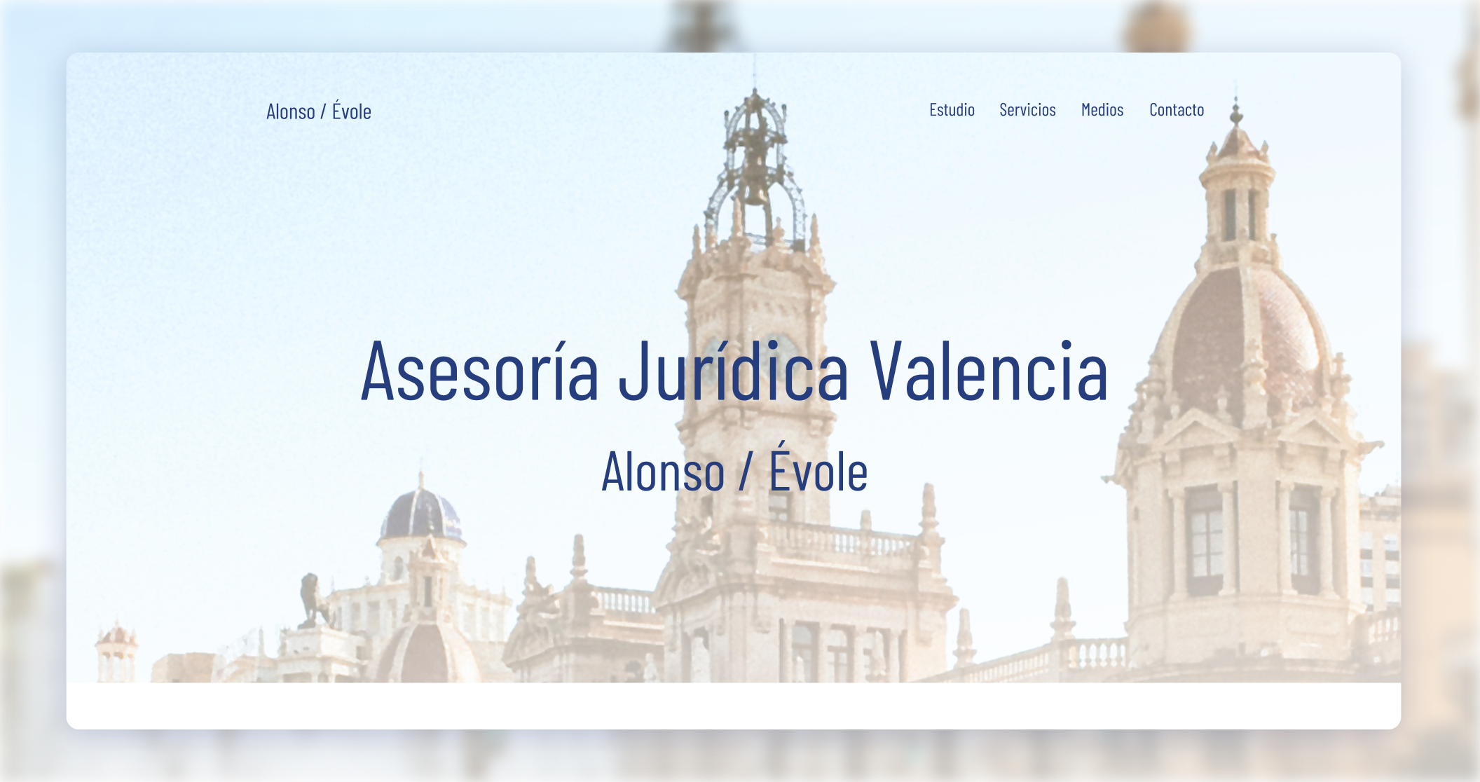
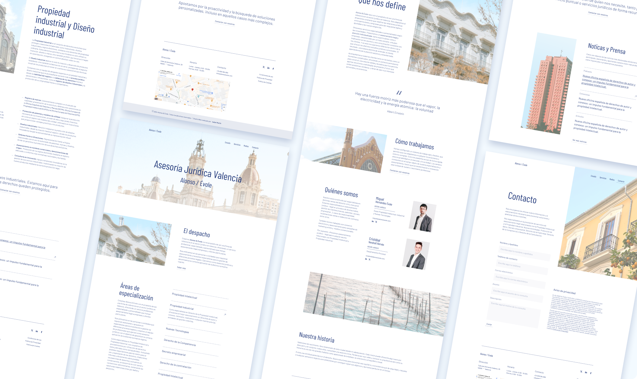
Ui design
Once the new identity design is defined, where white space takes center stage along with images related to the client's identity and soft color tones, I proceed to apply the identity to the website so that it can envelop the entire site.
Key points
Simplified main navigation menu.
Unified color tone across all images.
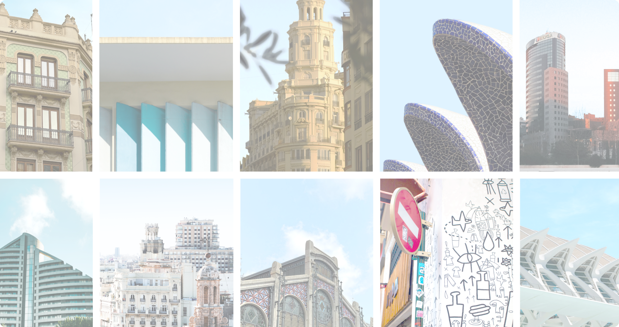
Key images featuring iconic city landmarks with the sky as a focal point.
Enhance the related articles section to keep users/readers engaged with the content.
Direct access to contact information throughout the entire site.
Expanded contact form.
Finalized mobile designs